Stacks, Cards and Controls
In Lesson 1 you built your first working stack. Now it's time to go deeper — understanding how stacks and cards are structured, how to navigate between them, and how to use the full range of controls HyperXTalk offers. By the end of this lesson you'll be comfortable building multi-card applications with a variety of controls.
- Understand the difference between Edit mode and Browse mode
- Use the Tools palette to select and create controls
- Add, name, and navigate between multiple cards
- Add and configure fields, buttons, and other controls
- Use the Property Inspector to set control properties
- Group controls together and move them as a unit
🔀 Edit Mode vs Browse Mode
HyperXTalk has two main modes you'll switch between constantly as you build your application:
Edit mode — lets you place, move, resize, and configure controls on your card. Controls don't respond to clicks in this mode — you're designing, not running.
Browse mode — runs your application. Buttons respond to clicks, fields accept input, and scripts execute. This is what your users will see.
Switch between them using the keyboard shortcut Cmd+9 on macOS or Ctrl+9 on Windows and Linux, or by clicking the arrow tools at the top of the Tools palette.
🧰 The Tools Palette
The Tools palette is your main design toolbox. It floats alongside your stack and contains everything you need to build your interface.
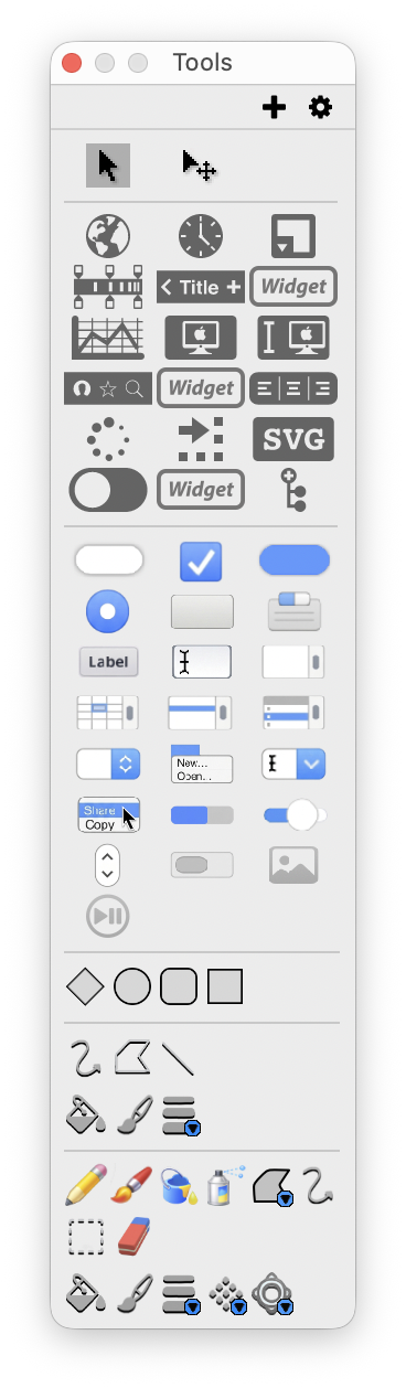
The top two icons are the most important: the arrow (pointer) tool puts you in Edit mode for selecting and moving controls, and the browse (hand) tool switches to Browse mode. Below those you'll find all the controls you can add to a card — buttons, fields, labels, images, sliders, and many more.
🃏 Working with Cards
Adding Cards
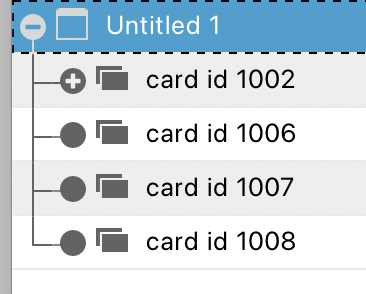
Every stack starts with one card. To add more, go to Object → New Card. You can add as many cards as your application needs — a simple two-screen app might have two cards, a complex multi-step form might have ten or more.
The Project Browser shows you all the cards in your stack at a glance:
Navigating Between Cards
In Browse mode you navigate between cards using scripts. The most common navigation commands are:
Naming Cards
Just like controls, cards can be given names. Click on the card in the Project Browser and use the Property Inspector to set a name. Named cards are much easier to navigate to in scripts — go to card "Login" is far clearer than go to card 3.
Shared Controls vs Card Controls
Controls placed on a card are only visible on that card. If you want a control to appear on every card — like a navigation toolbar or a logo — place it on the background instead. Background controls are shared across all cards in the stack.
🎛️ Adding Controls
To add a control, make sure you're in Edit mode, then either drag from the Tools palette or use the Object menu. When a control is first placed it will have a default name like "Field 1" or "Button 1" — you should always rename it to something meaningful straight away.
Fields
Fields hold text. They can be used for user input, displaying output, or both. A field selected in Edit mode shows handles you can drag to resize it:
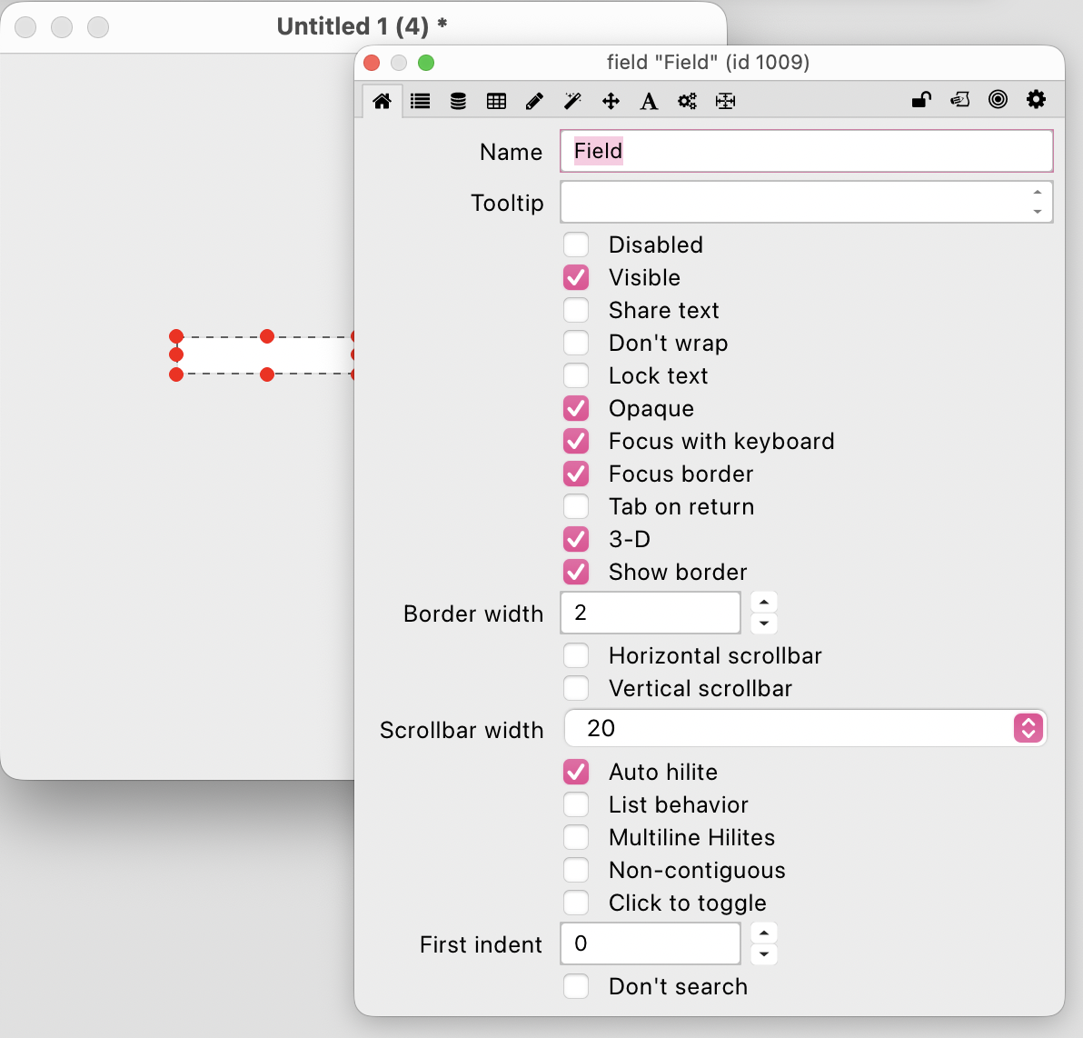
Key field properties include:
Name — how you refer to this field in scripts, e.g. field "Username".
Lock text — prevents the user from typing in the field, making it display-only.
Don't wrap — text stays on one line and scrolls horizontally.
Vertical scrollbar — adds a scrollbar for multi-line content.
Buttons
Buttons trigger scripts when clicked. They have a Name (used in scripts) and a Label (the text displayed on the button) — these can be different:
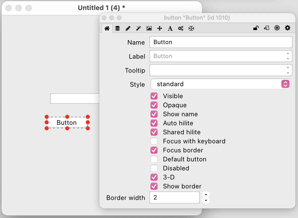
The Style property controls how a button looks — standard, rounded, checkbox, radio button, and more. The Default button checkbox makes a button respond to the Return key — useful for form submit buttons.
btnSubmit or btnCancel. When you have many controls on a card, clear names make your scripts much easier to read and maintain.
🔍 The Property Inspector
The Property Inspector appears when you double-click a control in Edit mode. It's your main tool for configuring everything about a control — not just its name and label, but its size, position, font, colour, and dozens of other properties.
The tabs along the top of the Property Inspector group properties by category. The most commonly used tabs are:
Basic — name, label, visibility, and core behaviour settings.
Size/Position — exact pixel coordinates and dimensions, useful for precise layouts.
Text — font, size, style, alignment, and colour for any text in the control.
Colors — background, foreground, and border colours.
You can also set properties in scripts. For example:
📦 Groups
A group is a container that holds multiple controls together. Once grouped, you can move, resize, show, or hide all the controls inside as a single unit — perfect for things like navigation bars, form sections, or panels that need to appear and disappear together.
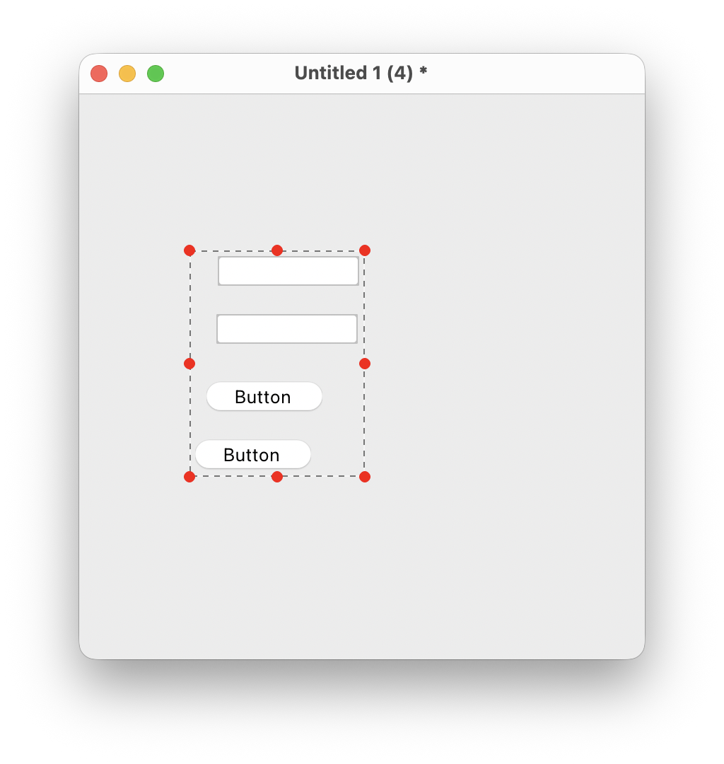
To create a group:
1. In Edit mode, select all the controls you want to group by clicking and dragging a selection rectangle around them, or by holding Shift and clicking each one.
2. Go to Object → Group Selected.
3. Give the group a name in the Property Inspector.
To edit controls inside a group, double-click the group to enter it, make your changes, then click outside to exit. You can also show or hide entire groups with a single script line:
In this exercise you'll build a simple two-card application — a welcome screen and a main screen — with navigation between them. Click any thumbnail to enlarge it.
-
Open HyperXTalk and create a new stack. Save it as
TwoCards.hyperxtalk. -
In the Tools palette, make sure you're in Edit mode (the arrow tool). Add a Label to your first card and set its text to
Welcome!. Add a Button and label itContinue ->. Your card should look like this: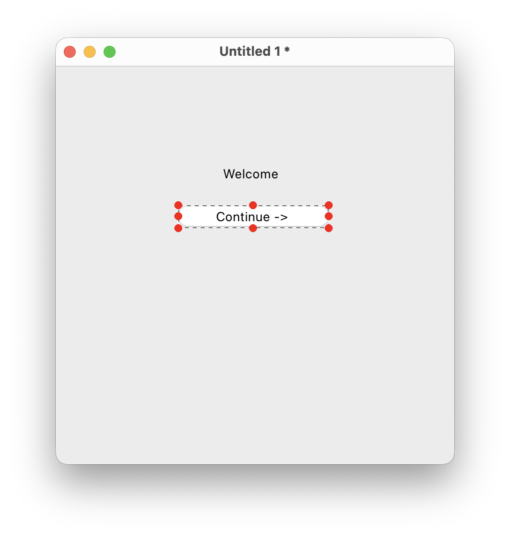 Card 1 — Edit mode
 -
Go to Object → New Card to add a second card. Add a Label saying
You Made It!and a Button labelled<- Back: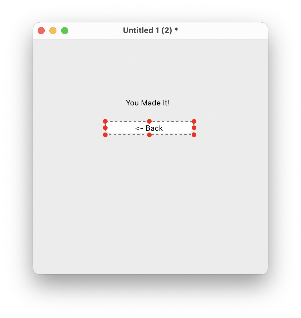 Card 2 — Edit mode
 -
Go back to card 1. Right-click the Continue -> button and choose Edit Script. Add this handler:
on mouseUp go to the next card end mouseUp
-
Go to card 2. Edit the script of the <- Back button:
on mouseUp go to the previous card end mouseUp
-
Switch to Browse mode (
Cmd+9/Ctrl+9) and test the navigation. Card 1 should look like this, and clicking Continue takes you to Card 2: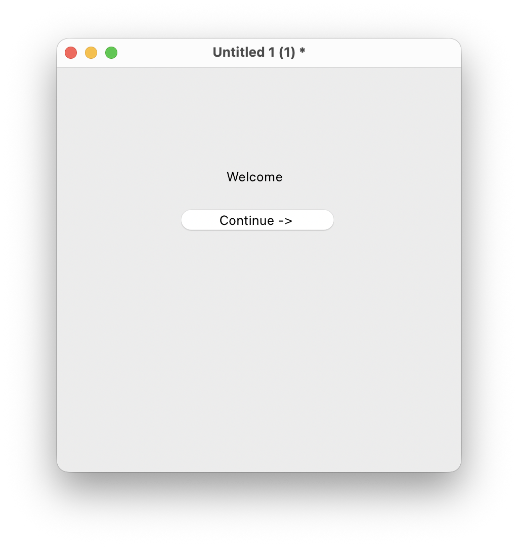 Card 1 — Browse mode
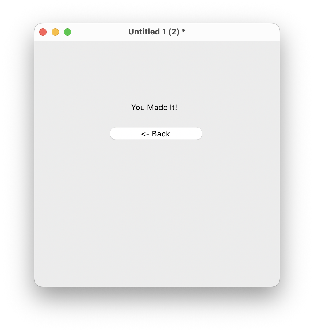 Card 2 — Browse mode
Bonus challenge: Add a third card with a "Home" button on each card that jumps straight to card 1 using go to the first card.
Cmd+9 on macOS and Ctrl+9 on Windows and Linux toggles between Edit and Browse mode.button "Submit". The Label is the text displayed on the button that the user sees. They can be the same or different.go to card "Settings" navigates directly to a named card. This is preferred over navigating by number, as it keeps working even if cards are reordered.set the lockText of field "Status" to true. This makes the field display-only.