Native Toolbars
HyperXTalk lets you add a native toolbar to any stack window — the same kind you see in Finder, Safari, and Mail on macOS, or matching the native style on Windows and Linux. In this lesson you'll learn how to create a toolbar, populate it with SF Symbols icons, and respond to toolbar button clicks in your scripts.
- Understand what a native toolbar is and when to use one
- Create a toolbar and attach it to a stack window
- Add items with labels and SF Symbols icons
- Handle
toolbarItemClickedmessages in a script - Show and hide the toolbar
🛠️ What is a Native Toolbar?
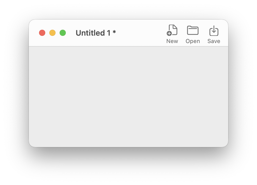
A native toolbar is the row of icon buttons that sits at the top of a window, just below the title bar. Unlike buttons you place on a card yourself, a native toolbar is rendered by the operating system — which means it automatically adopts the system appearance, responds to dark mode, supports customisation by the user, and looks exactly like the toolbars in the OS's own apps.
HyperXTalk's toolbar support is provided by the org.openxtalk.nstoolbar extension. You interact with it entirely through plain HyperXTalk script — no Objective-C required.
🔨 Creating a Toolbar
You create a toolbar with the create toolbar command, giving it an identifier name and telling it which stack window to attach to:
The first argument is the toolbar's identifier — a string you choose. You'll use this same identifier in every subsequent command that refers to this toolbar. The identifier must be unique within your stack.
To make the toolbar visible, set its toolbarVisible property to true:
🧩 Toolbar Items
Each button in a toolbar is called an item. Items are identified by a short name you choose — like "fileNew" or "fileSave". For each item you want to add, you set its label and icon, then add it to the toolbar's item list.
Setting Item Properties
Adding Items to the Toolbar
Setting labels and icons registers the items, but doesn't add them to the visible toolbar yet. You control which items appear — and in what order — by setting the itemNames property to a return-separated list of item identifiers:
The order of the names determines the order of the buttons from left to right. You can reorder or change the items at any time by setting itemNames again.
Toolbar Item Properties at a Glance
| Property | What it does |
|---|---|
| itemLabel["id"] | The text label shown beneath the button |
| itemIcon["id"] | An SF Symbols name (e.g. "folder") or the filename of an image imported into your stack (e.g. "MyLogo.png") |
| itemNames | Return-separated list of item IDs that appear in the toolbar, in order |
| toolbarVisible | Whether the toolbar is shown (true) or hidden (false) |
🔣 SF Symbols Icons
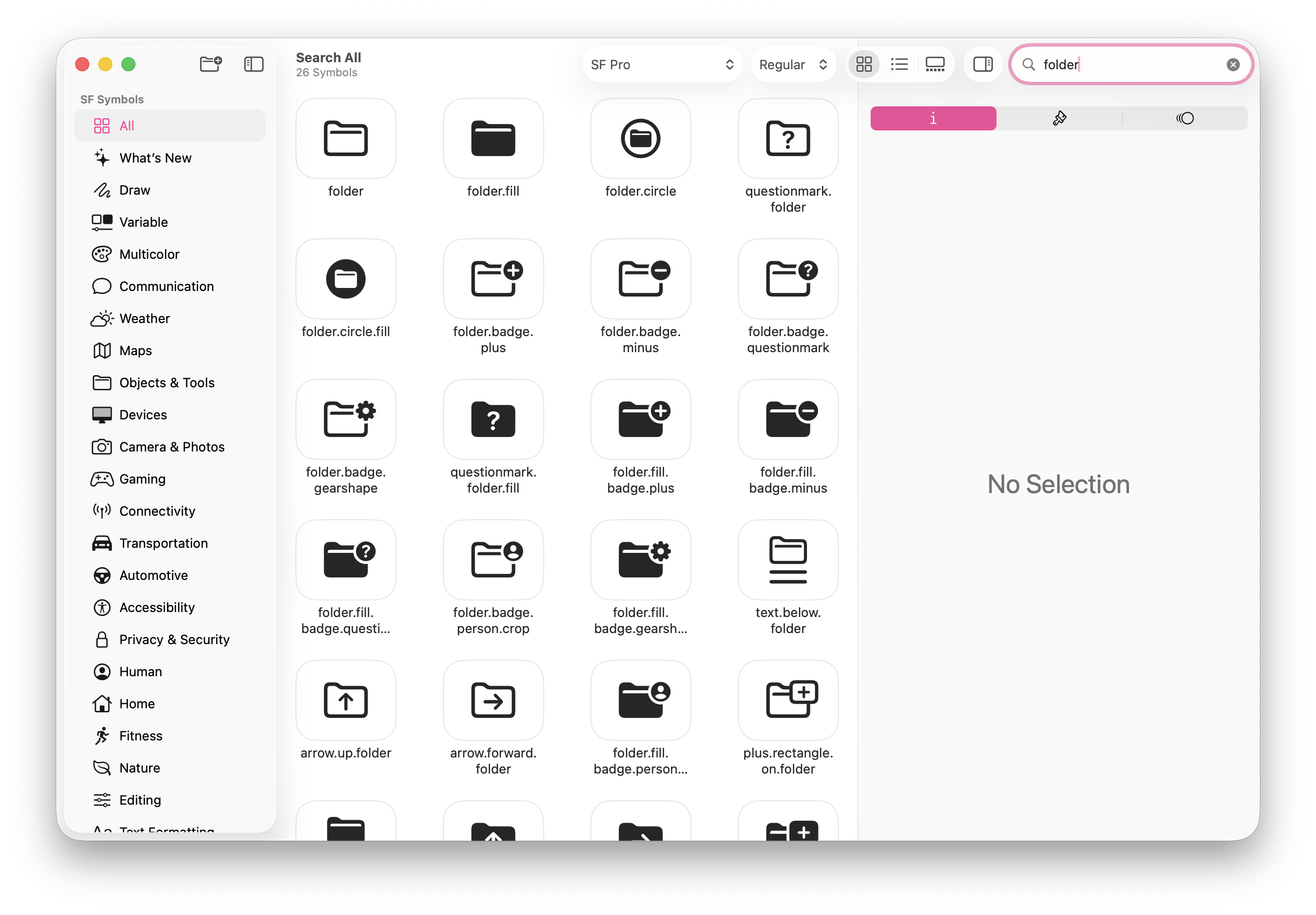
Item icons are specified using SF Symbols names — Apple's built-in icon library. There are over 6,000 symbols covering almost every common UI concept.
Some commonly useful symbols for toolbar items:
| Symbol name | Looks like |
|---|---|
| doc.badge.plus | New document |
| folder | Open folder |
| square.and.arrow.down | Save / download |
| square.and.arrow.up | Share / export |
| arrow.uturn.backward | Undo |
| arrow.uturn.forward | Redo |
| trash | Delete |
| magnifyingglass | Search |
| gear | Settings |
| info.circle | Info / about |
| printer | |
| pencil | Edit |
👆 Handling Toolbar Clicks
When the user clicks a toolbar button, HyperXTalk sends a toolbarItemClicked message to the stack, passing the item's identifier as a parameter. You handle this in your stack script or card script using a switch statement:
The switch statement checks pItemName against each case in turn, running the matching block and then stopping at break. This is the cleanest way to handle multiple toolbar items.
toolbarItemClicked handler can live in your stack script or a card script, but not in an object script (such as a button or field). Place it wherever makes the most sense for your application's structure.
Putting It All Together
Here's a complete, self-contained example. Put this entire script in your stack script and it will build the toolbar when the stack opens:
⚙️ Show & Hide
Toggle the toolbar's visibility at any time — for example, to let the user show or hide it from a menu:
Create a simple text editor stack with a toolbar containing formatting controls.
- Create a new stack called
TextEditor.hyperxtalkand add a scrolling field namedEditorthat fills most of the card. - Open the stack script and add an
openStackhandler that creates a toolbar called"formatBar". - Add four items:
"textBold"(Bold, icon:bold),"textItalic"(Italic, icon:italic),"textUnderline"(Underline, icon:underline), and"textClear"(Clear, icon:trash). - Add a
toolbarItemClickedhandler. For Bold, Italic, and Underline, toggle the relevant text style of the selected text in the Editor field. For Clear, set the text of the Editor field to empty. - Test by typing some text in the field, selecting it, and clicking your toolbar buttons.
Bonus challenge: Add a fifth item called "fileSave" (Save, icon: square.and.arrow.down) that saves the stack when clicked.
create toolbar "identifier" in this stack creates a new toolbar and attaches it to the stack window.itemNames property to a return-separated list of item identifiers in the desired order.toolbarItemClicked is sent with the item identifier as a parameter. It can be handled in the stack script or a card script, but not in an object script such as a button or field."folder") — Apple's built-in icon library browsable via the free SF Symbols app — or the filename of an image imported into your stack (e.g. "MyLogo.png").toolbarItemClicked message with the clicked item's identifier as a parameter (e.g. pItemName). You use a switch statement in your stack or card script to check the identifier and run the appropriate code.